Money on my Mind
A mobile app created for the Champlain Valley Office of Economic Opportunity, to facilitate completion of their Financial Futures program.
Introduction
summary
Money on my Mind is a mobile app aimed at improving the completion rate for participants in the ReachUp/Financial Futures Program. This program is offered through the Champlain Valley Office of Economic Opportunity.
My role: UX Research, UX Design, Visual Design, Branding.
Deliverables: User Research, Competitive Analysis, Wireframes, Usability Testing, Preference Testing, High Fidelity Mock Ups, Animation, Prototype.
Tools Used: Figma, Photoshop, Illustrator, InVision, UsabilityHub, Draw.io, Pen & Paper.
Timeframe: 3 months in 2019
The Problem
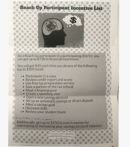
Participants in the Financial Futures program were routinely missing out on program benefits due to missed appointments and lack of benefit awareness.
Constraints: The only information that we can access, is a daily .csv file export from the program’s Outcome Tracker system. Additionally there would be no opportunity to update the information in Outcome Tracker.
Delivering value within these technical constraints was my challenge for this project.
The Ask:
- Help participants stay in the program, and more effectively reach program milestones and goals.
- Come up with a design that creates maximum value within these limiting constraints.
- Be “playful” and “fun.”
The Solution
Money on my Mind:
- A mobile app for iOS and Android.
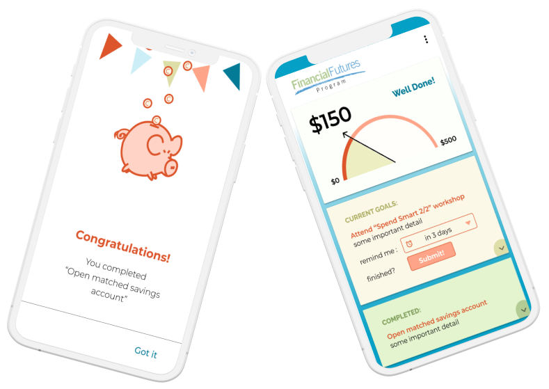
- Part educational roadmap, part financial tracker.
- Simple, single-pane-of-glass dashboard.
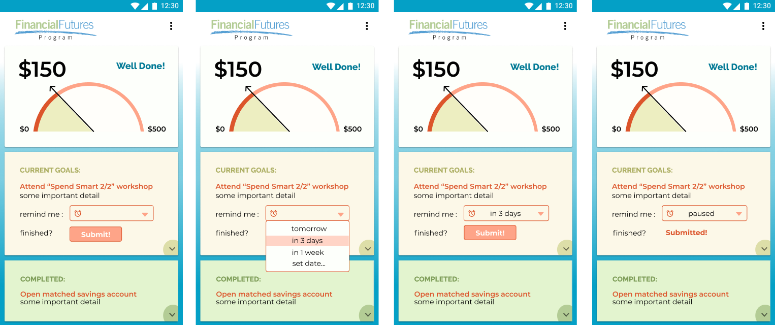
- Set and pause push notifications for reminders about goals in progress.
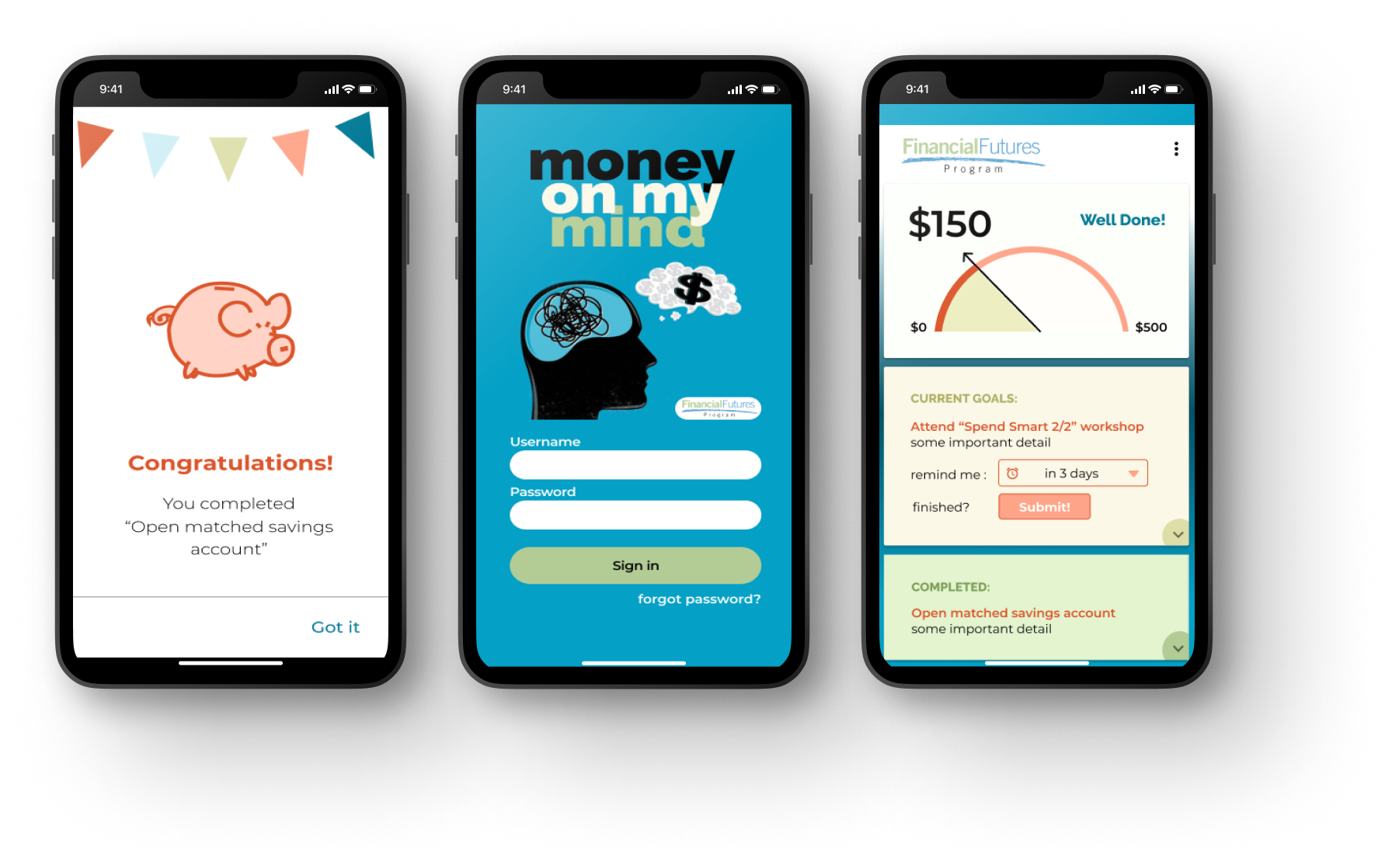
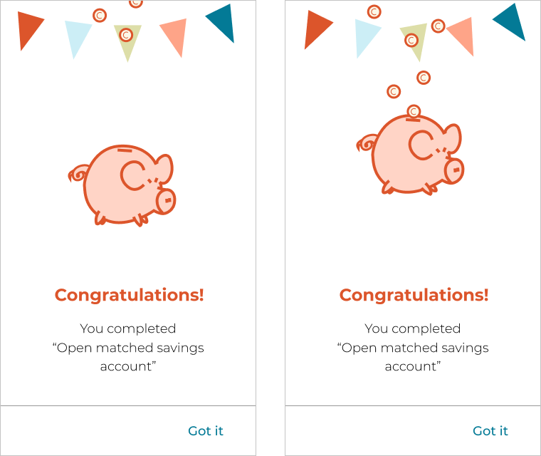
- Party when goals get marked complete by coaches.
- Goals “submitted” as complete are marked as “pending approval” while waiting for tracker update.
- A jumping piggy bank!
My Process
Research
Discovery activities:
- Reading all the printed and marketing materials for the program, to fully understand it's structure.
- Interviews with program director and coaches (no access to participants for confidentiality reasons).
- Our Field Studies with coaches, watching them using the milestone tracker.
Key Insights:
Though I had no access to actual users, I got a lot of second-hand information from my discussions with their coaches. This helped identify the main barriers to completion:
- Forgetting when scheduled meetings, classes or deadlines were.
- Losing track of progress made, their potential financial reward and the steps needed to finish.
Competitive analysis
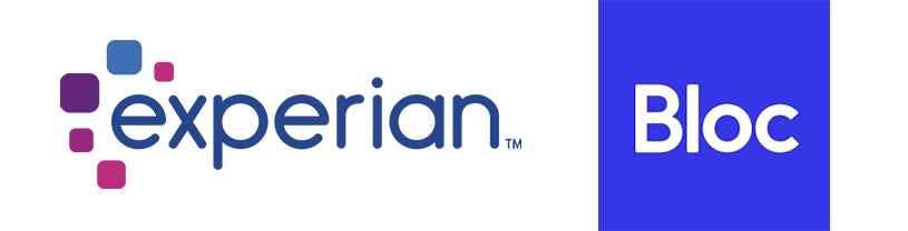
Even when there are no direct competitors, I often like to review other products that I believe are trying to solve similar problems.
Two apps that I looked at were Experian for financial reporting and Bloc.io for educational roadmap inspiration.
Results of my analysis:
Experian:- The experian app featured a “snippet” of all relevant information, on the landing dashboard. It was organized in a linear sequence, with the option to deep-dive into each section. There was also a summary “score” at the very top, that related to the content below.
Bloc.io: Bloc was an educational program with a nice mobile dashboard. I liked how they represented “progress” and “position” in relation to their final goal.
Wireframes
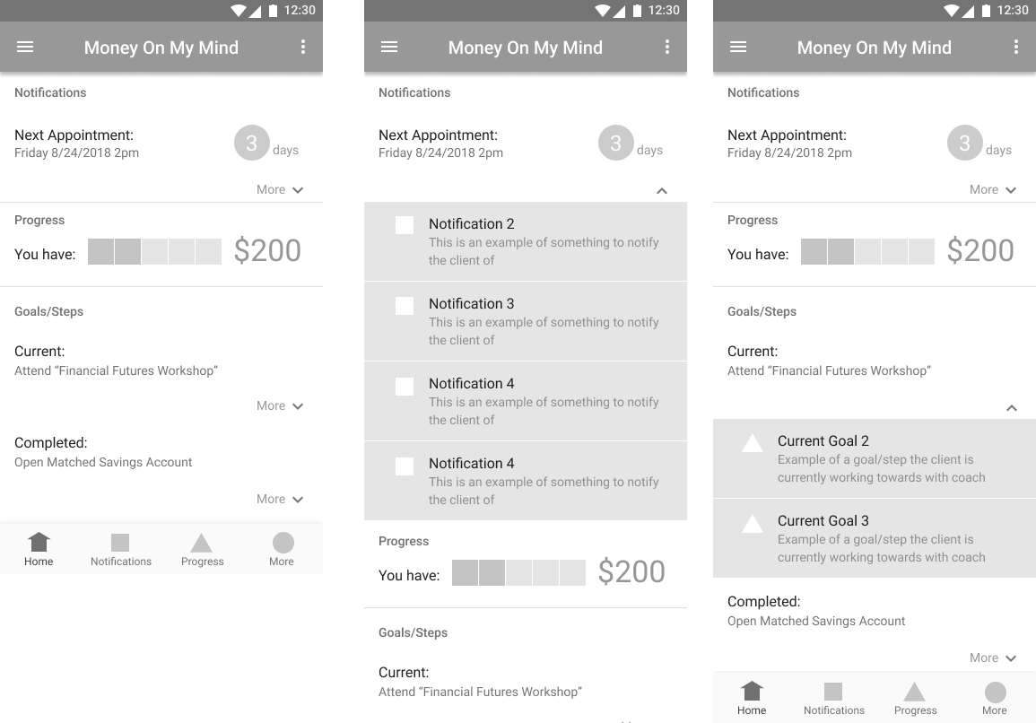
I started with low fidelity wireframes, incorporating some ideas from my competitive analysis, as well as the needs identified by talking to coaches.
My goal was to simplify the information architecture as much as possible and present a summary of relevant information on a “single-pane-of-glass.”
Usability Testing
A couple of changes before we moved on to visual design.
Visual Design
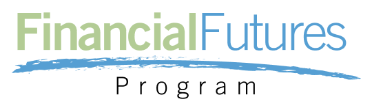
Round one:
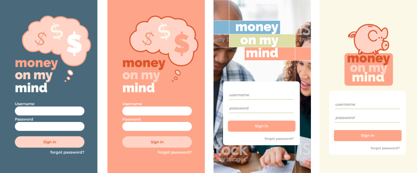
The Design Brief asked for something “playful and fun.” Some proposed mock-ups of
a login screen to
preference test
Though the client liked our designs, they already had a brand graphic they wanted to incorporate.
Round two:
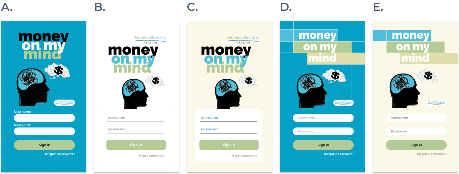
Option "A" emerged as the favorite in our
preference tests.
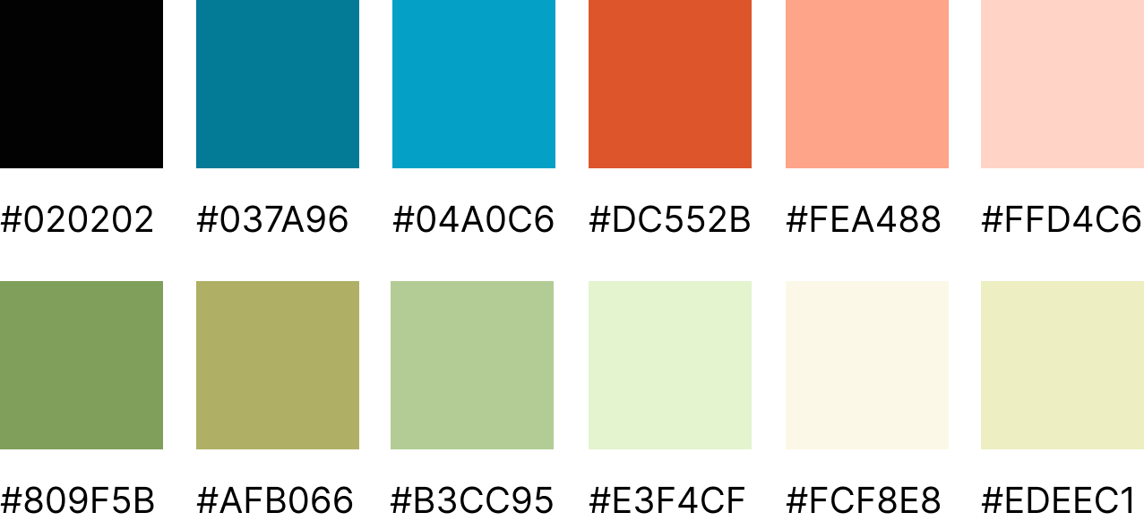
Color Palette:
The selected login screen informed the color palette and direction
for the rest of the app.
I used darker shades for text and lighter tints for backgrounds.
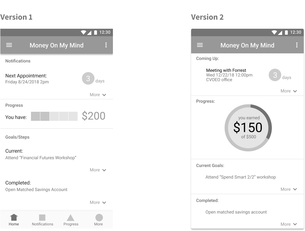
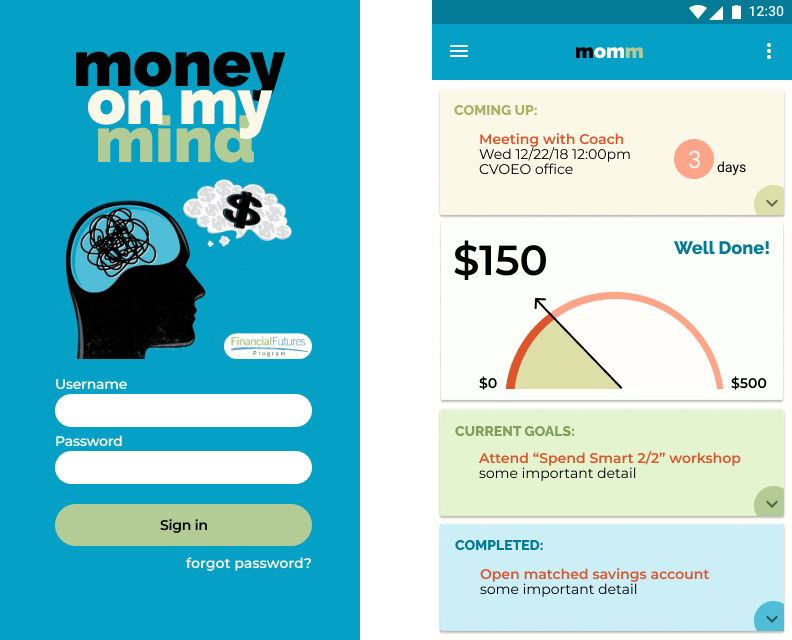
Dashboard Design:
Design Reviews
Before finalizing designs, I conducted a round of reviews with stakeholders, engineering and product management. This led to a few more alterations:
- Engineering didn’t believe we could populate the “coming up” card. So, we needed to remove that for now.
- The client wanted to use the Financial Futures logo, instead of the custom MomM logo.
- The client wanted a way for participants to get reminders. So we made an option for the user to set and control scheduling reminders, independent of the outcome tracker.
- Users could also mark a goal complete, in order to pause the reminder, even if it didn’t interact with the actual tracker.
- One last request... how can we make this even more engaging and “fun”?
The Fun
One topic that kept coming up since the early visual design drafts:
Conclusion
Impact
- Coaches reported the rate of missed appointments dropped by 35%.
- The number of participants that completed the program increased by 40%.
- Those participants that didn’t complete the program, still earned 25% more than those who had not completed in the past.
- Participants loved the jumping pig!